solidifying cleanstart's role
To establish CleanStart as a one-stop shop that services the community by developing a Brand and Creative strategy embodying its dedication to doing difficult jobs with professionalism and care, displaying compassion and discretion towards clients and offering opportunities to those with barriers to employment.


new yet familiar branding
When it came to refreshing CleanStart’s brand identity, we wanted to express their bravery, passion and commitment as a team and to the people they service. To represent this social enterprise dedicated to building a more equitable future, we created an identity that acknowledges how they started and recognizes their growth as an organization.
The new branding places focus on the individuals behind CleanStart and revealing the work that they do while on the job, to highlight their resiliency and authenticity when tackling challenging real-life situations.


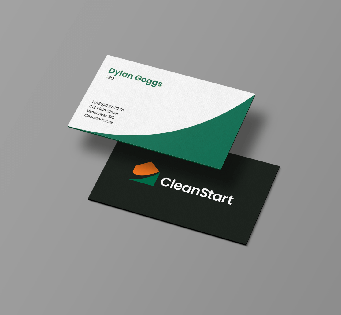
logo design details
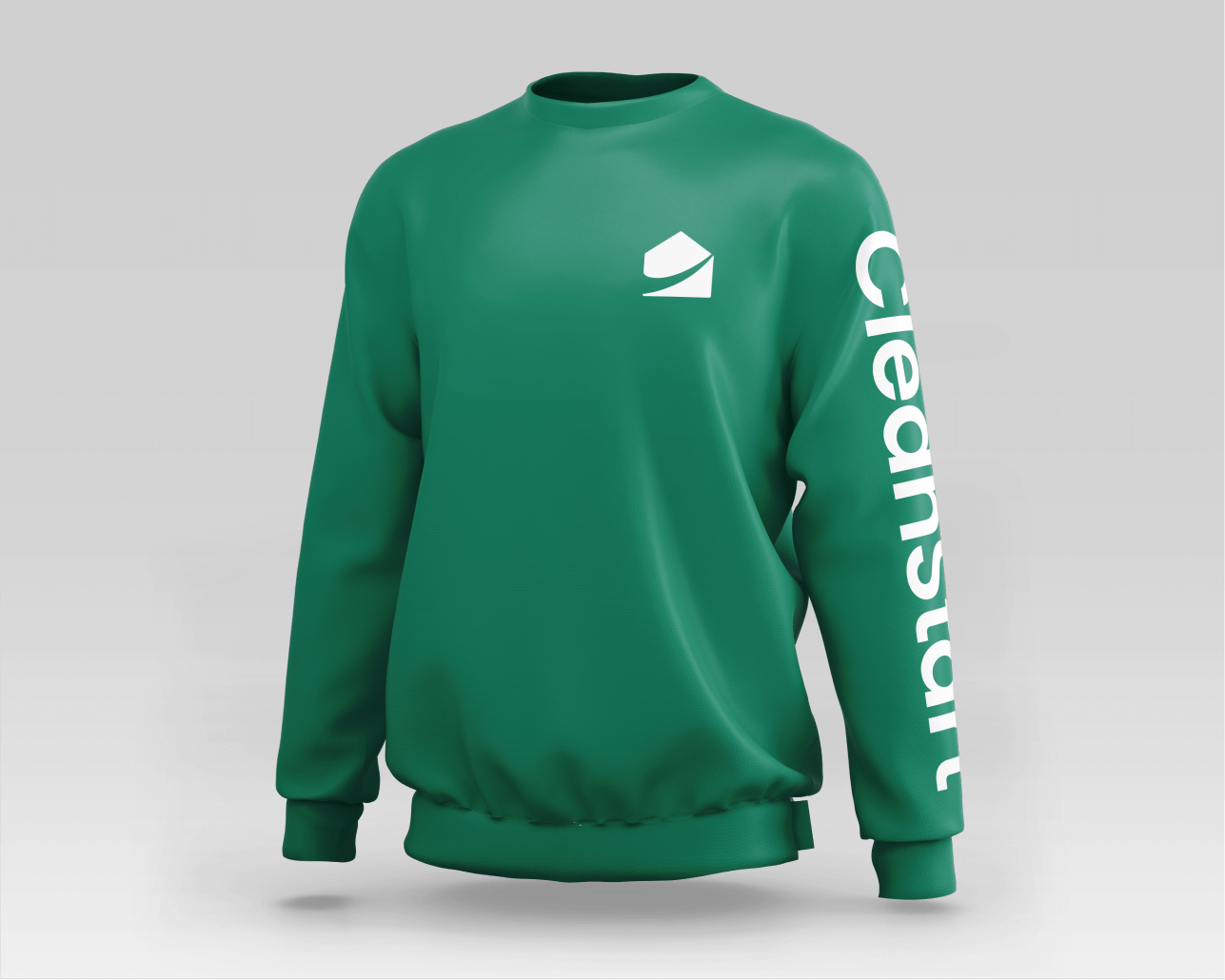
The new logo icon captures the silhouette of a house and the upwards motion of the previous icon, with the negative-space swoosh symbolizing how CleanStart helps people turn a new page and transform their lives. Vibrant orange is used to convey the passion, enthusiasm and change CleanStart delivers, while dark green balances with a grounded, down-to-earth feel.
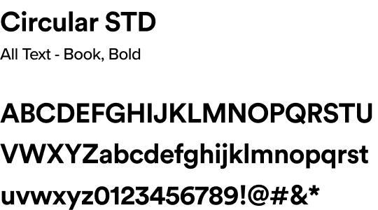
The logotype uses a well-known geometric sans-serif that evokes an approachable and adaptable feel, contrasting with the bold shape and colours of the icon when paired together.

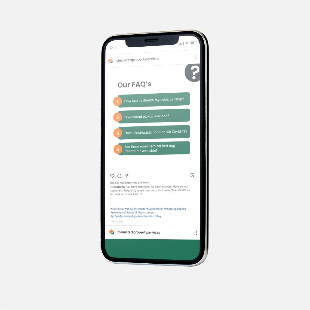
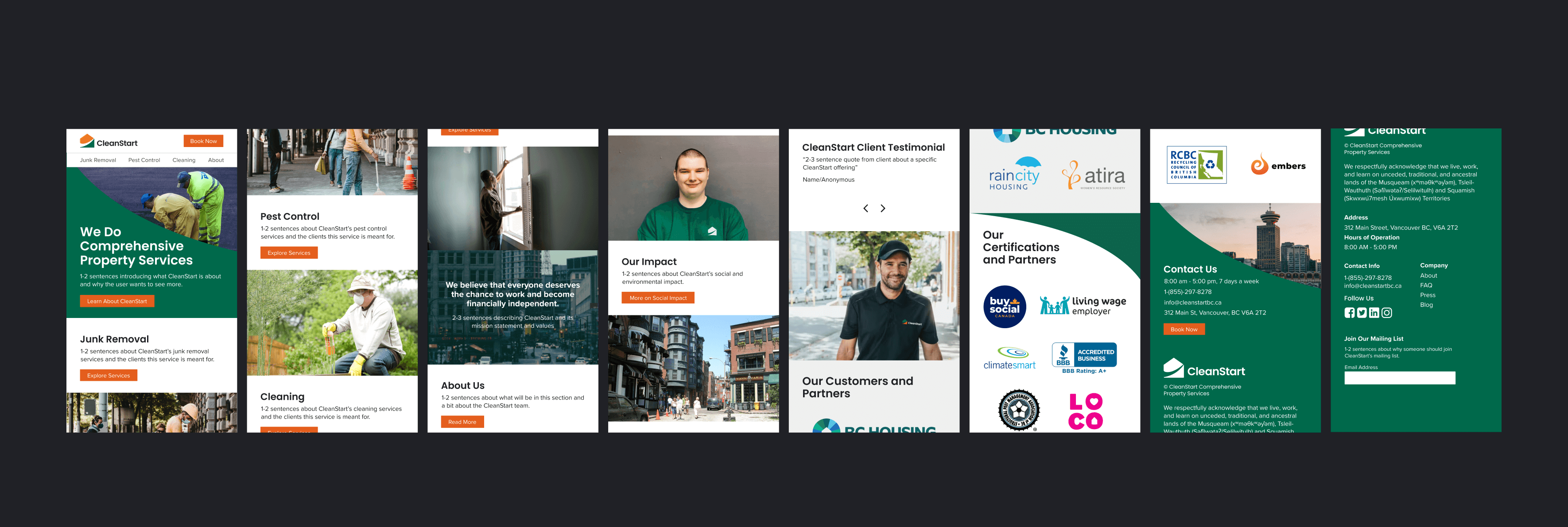
answering questions effectively
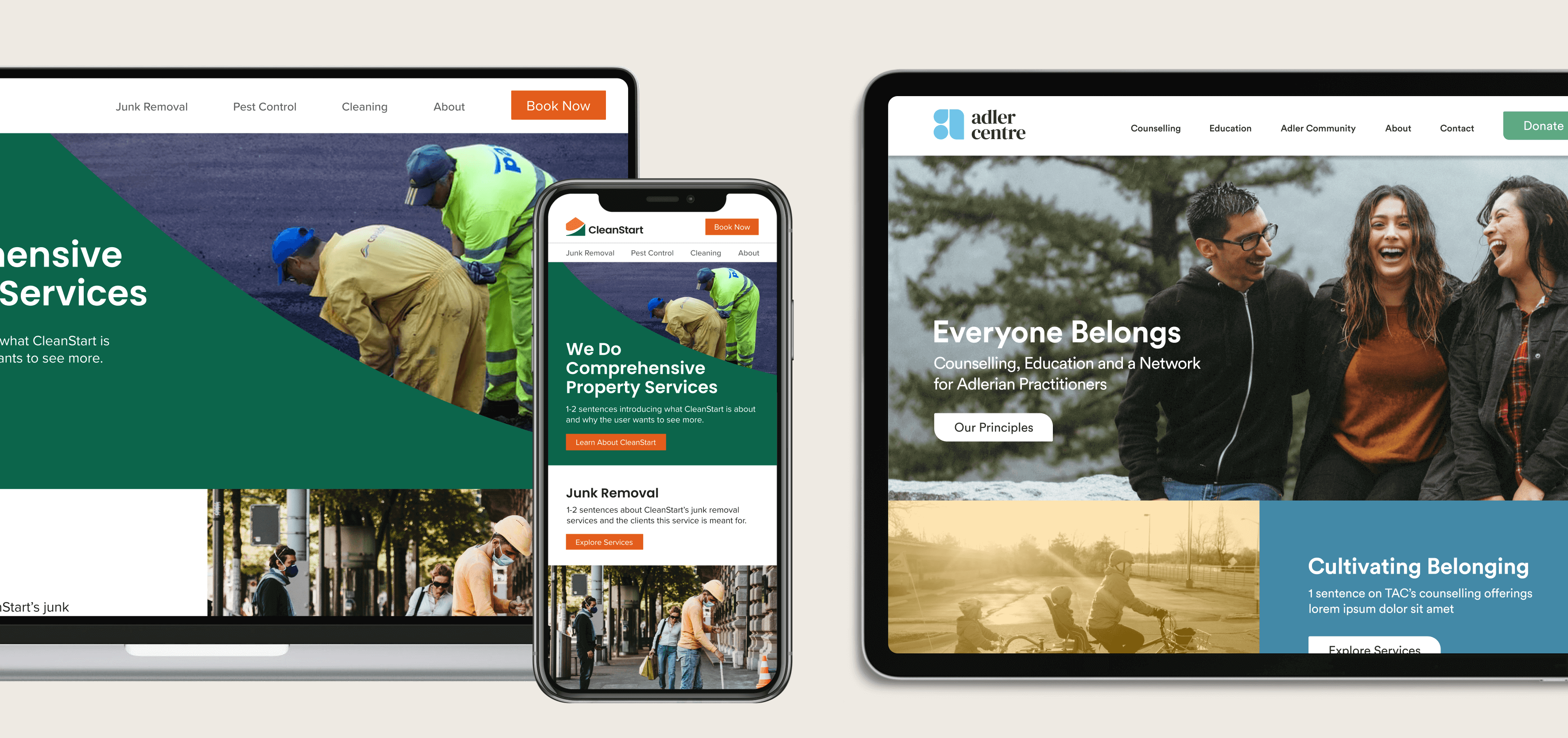
Informed by client and landscape research, the design of the new responsive website clearly provides information about the variety of services CleanStart offers and easily answers frequent inquiries all in one place. The website design is also flexible to accommodate for future expansion of available services.


a hub for adlerian psychology
To expand the Adler Centre’s reach within the community as a welcoming place to receive support and education long-term, through the development of a Brand and Creative strategy that communicates their role as one of the world’s premier education hubs on Adlerian psychology, offering long-term, low-cost counselling therapy, workshops, parent support groups, accreditations, practicums and a network for Adlerian professionals.
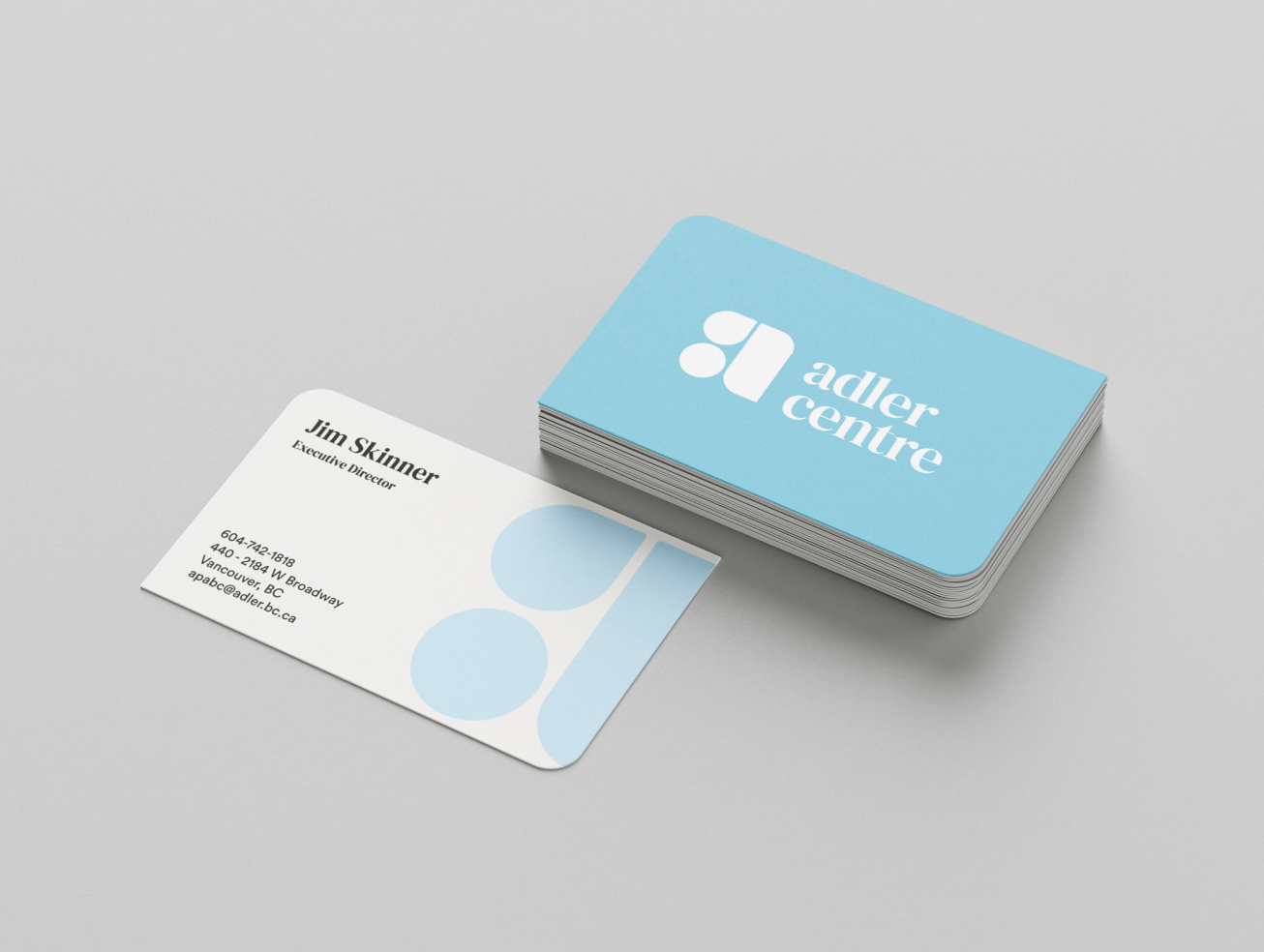


creating a sense of belonging
While developing a refreshed brand identity for the Adler Centre, we crafted an identity revolving around themes of growth as an individual and within a community. These motifs can be seen within the logo icon, composed of a leaf-like shape, a speech bubble and a circle all coming together in a modular arrangement, to form the letter ‘A’.
A light blue was chosen as the primary brand colour to express the calm, spiritual and reliable aspects of the Adler Centre, while a sage green conveys the stability the Centre provides as they help the members of their community grow. These colours are supported by teal and muted blue, which further reinforce a responsible and professional feel.
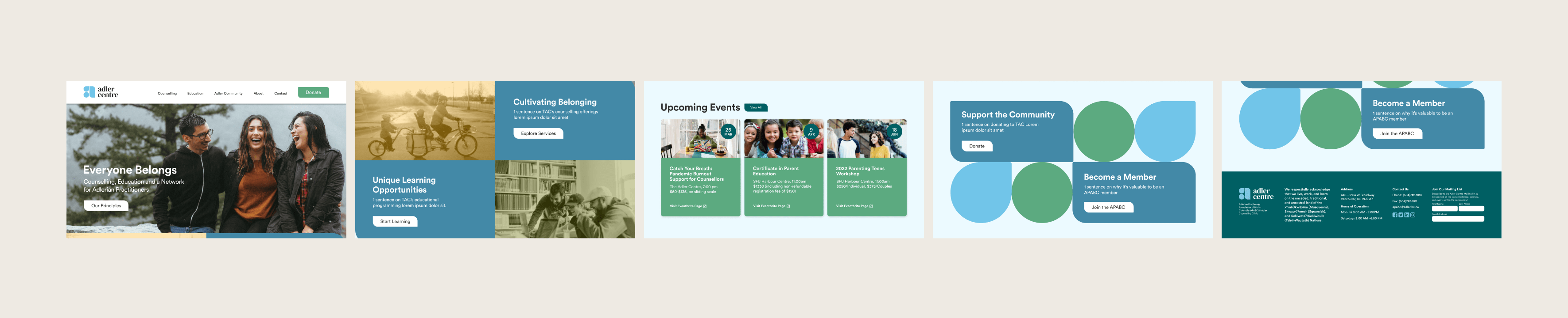
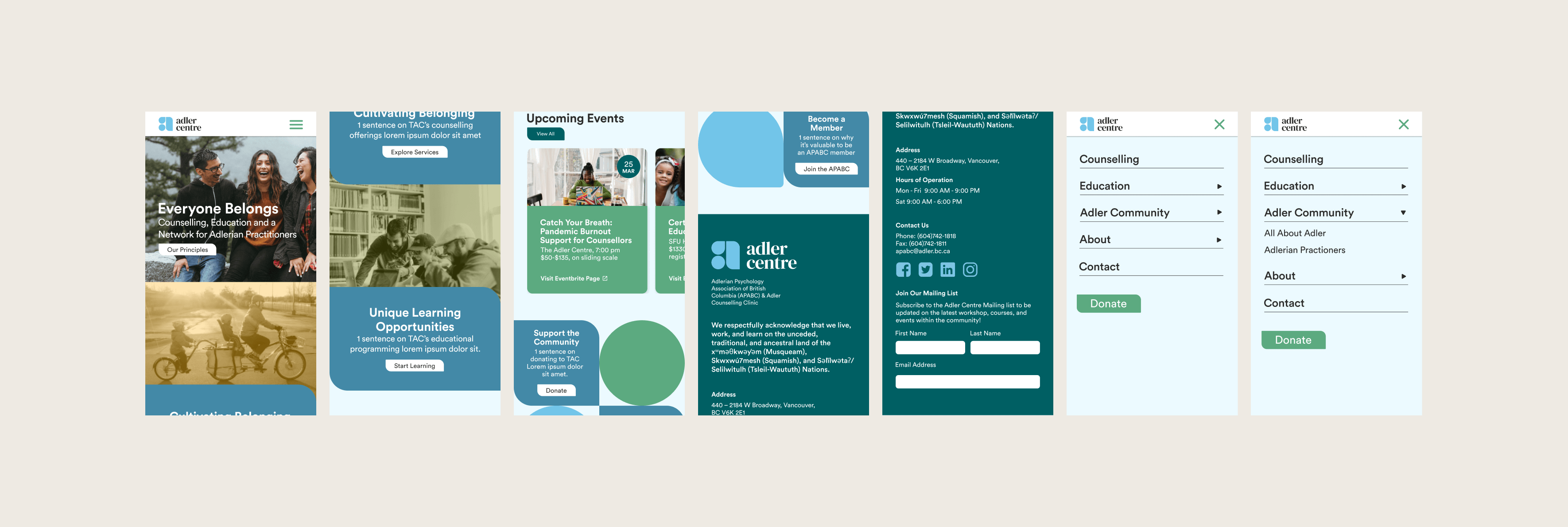
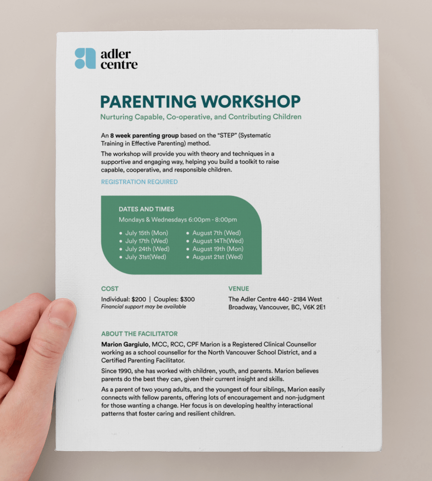
simplifying getting involved
Easily accessible and clearly marked information is extremely important for those coming to the Adler Centre looking for support, so the website design focused on minimizing the number of web pages a person would need to sift through as well as careful categorization of services and activities available, in accordance to insights from client and landscape research.