event and project context
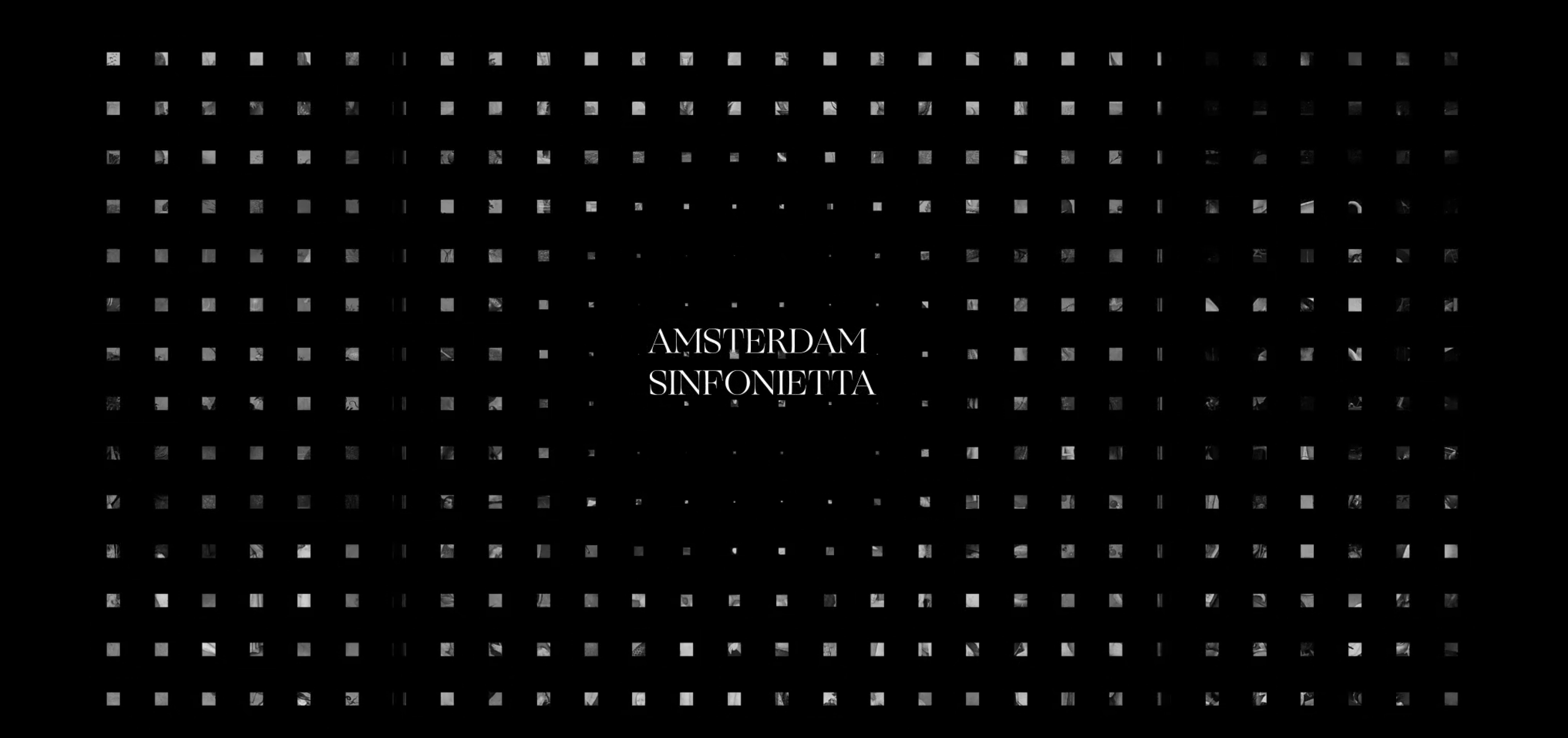
Amsterdam Sinfonietta is a world class string orchestra from the Netherlands known for its groundbreaking programmes using a variety of unexpected musical genres and art forms. The Sinfonietta has been selected to perform the 2022 Bosch Requiem, as a new Bosch Requiem has been composed and performed annually since 2016; the year that commemorated the 500th anniversary of notable Dutch painter, Hieronymus Bosch’s passing.
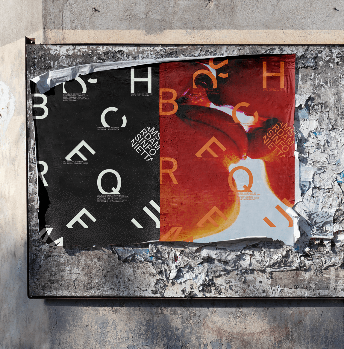
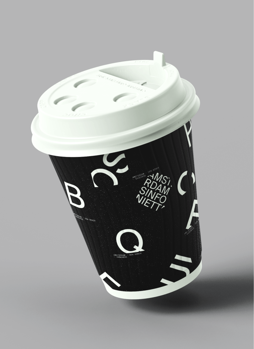
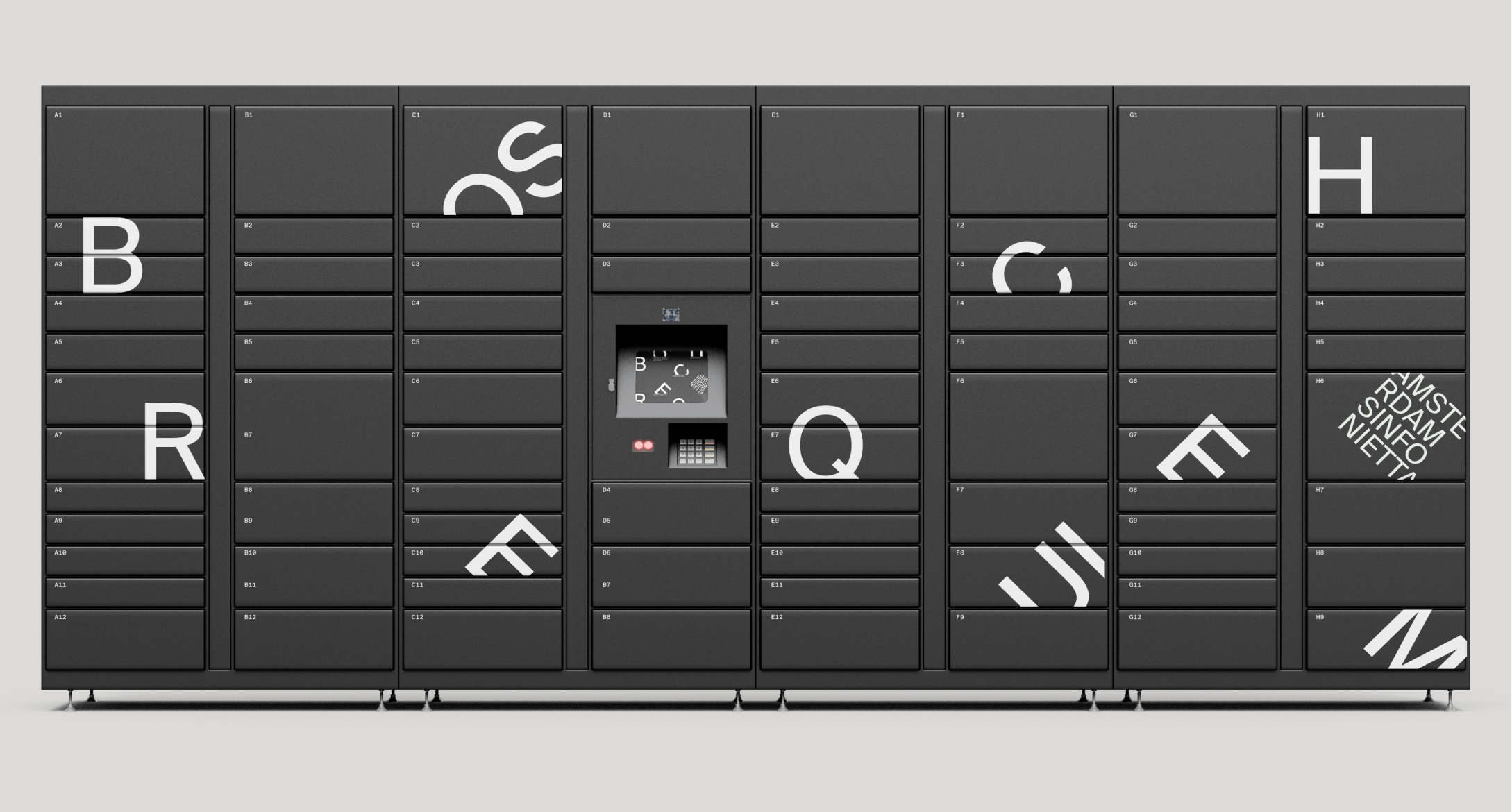
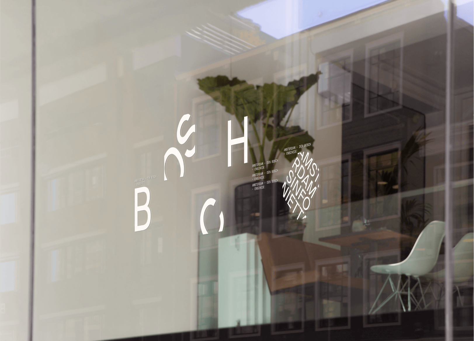
Through study of designer Wolfgang Weingart and design agency Studio Dumbar, we extracted identifying attributes of their work and applied our learnings into a visual brand identity that translated into a microsite led by expressive, yet functional web interactions. For a detailed breakdown, view our Final Slide Deck.
pre-event intervention
By intervening in the pre-visit and promotional stage of the event, we leveraged the Bosch Requiem’s identity as a highly anticipated annual performance to boost the appeal of attending to a person looking for performance information.
microsite walkthrough
uncovering the requiem
Over the course of the project, I produced all written content presented, along with sourcing and colour treatment of image and video content used within the microsite.
I also lead the content strategy to create a narrative that encourages the viewer to explore the rich history and intrigue around the event.
We aimed to lead the viewer on a scavenger hunt that unveils the mystery behind the Bosch Requiem, by guiding the user through the reasons people have attended the performance in previous years, displaying the history of the painter, legacy performances and teasing what’s to come in the current year.
entering the microsite
We established the idea of exploring and revealing from the landing page. The viewer is immediately introduced to the animated square cursor, which acts as a guide to more information.
The painting used here is Hieronymus Bosch’s most well-known painting, “The Garden of Earthly Delights” and intentionally shown in greyscale to keep attention on the animated cursor that allows the viewer to find their way into the site.
conception of the requiem
On the landing page, users are encouraged to scroll down, taking them through a gallery-walk type experience. This process shows small close-up glimpses of the full-colour details in the painting. Concise descriptions about the Bosch Requiem are shown when hovering the cursor on these image clusters, reinforcing the user’s ability to use their cursor as a guide and to reveal elements.
The viewer can also view their progress through the microsite by looking at the fixed navigational element on the left side of the screen. This also allows the viewer to revisit any area of the site they have already seen, or skip to purchasing a ticket.

legacy performances
Arriving in the legacy section, the user is greeted with video thumbnails that lead to teasers of past performances. These thumbnails are arranged chronological order, along a timeline that overflows beyond the screen, prompting a user to check out what the Bosch Requiem was like before.
the 2022 requiem
Once the viewer has scrolled beyond the legacy section, details about the current performance year are shown. Each performer is highlighted in their own section, where the next performer can be accessed after a user uncovers the image. A thumbnail of the previous performer is then stored on the side for quick access.
ticket purchase
As the viewer reaches the final section of the page, we shifted to an approach that favoured functionality through simplification of key interactions and responses from the main site. This allowed us to maintain visual consistency for the user while providing an easy ticket purchasing experience.